
Reimagining Affirm
for Gen Z
Certain client data, research, and product details have been generalized or omitted.
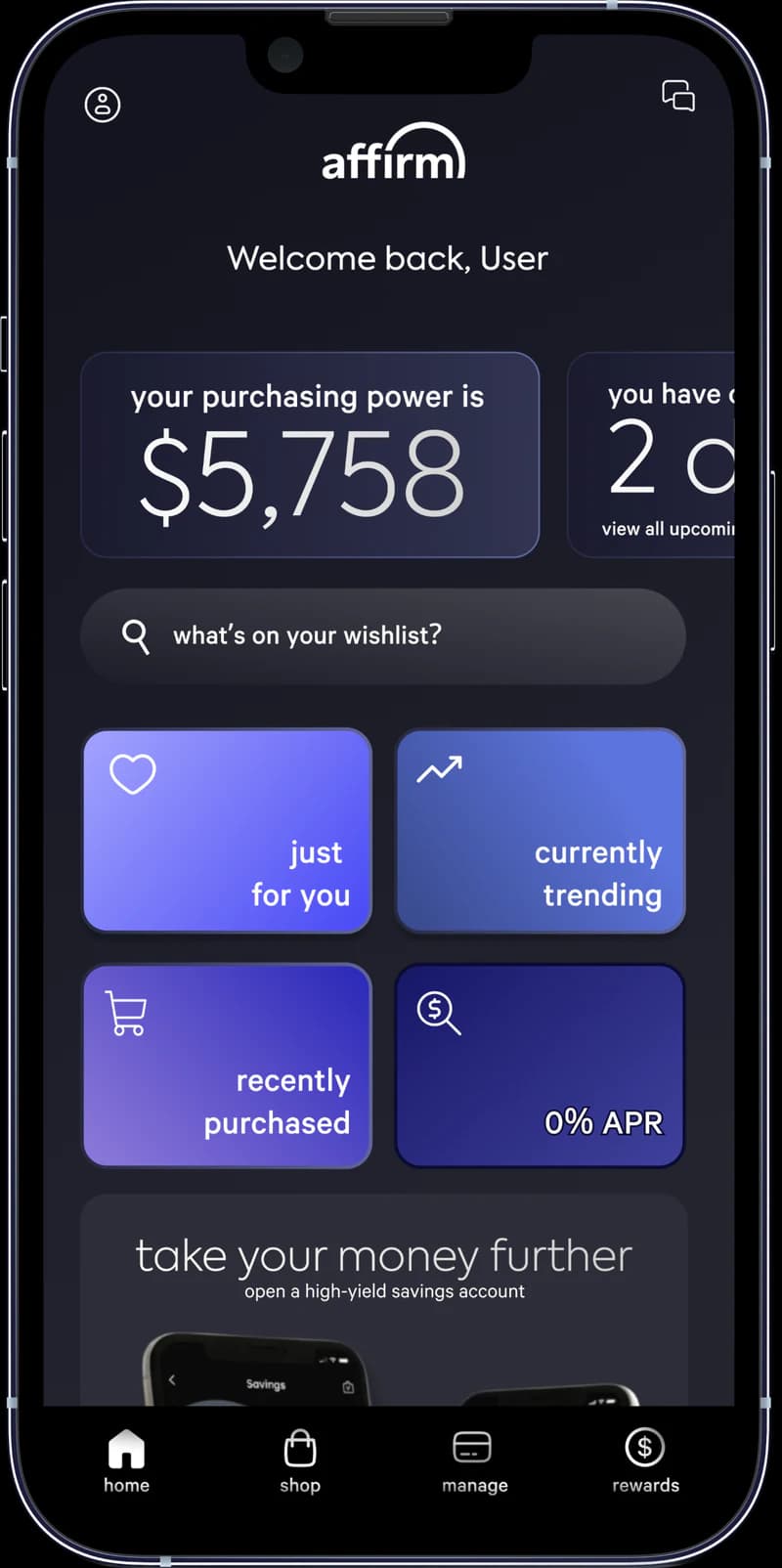
Product strategy
Connected discovery, card adoption, and loyalty
Strategic tradeoff
Balanced retention growth with responsible spending
Product outcome
Reusable card recommendation now reflected in the live app
The problem
Affirm was valuable at checkout, but its app offered fewer reasons for Gen Z users to return.
Of the 8 UX pain points identified, two stood out: the Affirm Card was hidden, so users had to search for it, and nothing in the app encouraged them to reopen it between purchases.
Across 6+ competitors benchmarked, financial apps were introducing more engaging interfaces and loyalty-driven experiences aligned with Gen Z expectations.
Strategy
Creating more reasons to explore, adopt, and return
Explore products
Product-focused discovery beyond merchant names
Adopt the card
A dedicated destination for card value and controls
Return for rewards
Loyalty that recognizes continued engagement
Interventions
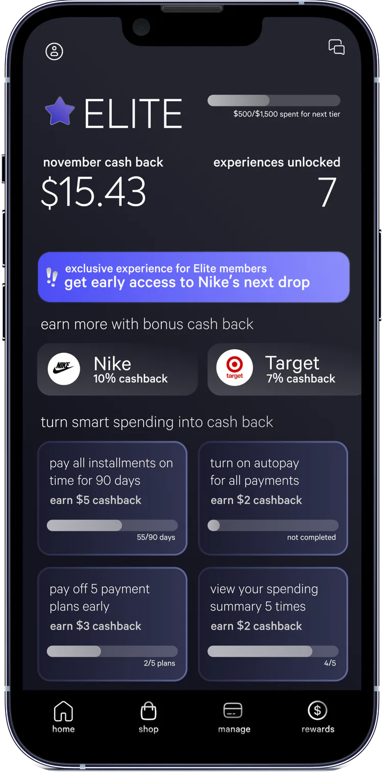
Loyalty that rewards continued engagement
Developed a loyalty concept designed to reward continued use and create a more differentiated relationship with Gen Z consumers.
- Rewards tied to meaningful activity
- Visible progress toward benefits
- Ongoing incentives beyond a single purchase
Reward good financial behavior, not more spending
A loyalty program could drive repeat use, but rewarding excess spending would conflict with Affirm's financial-responsibility mission. I instead tied rewards to on-time payments and responsible account behavior while avoiding spending streaks, urgency, and pressure-based incentives.
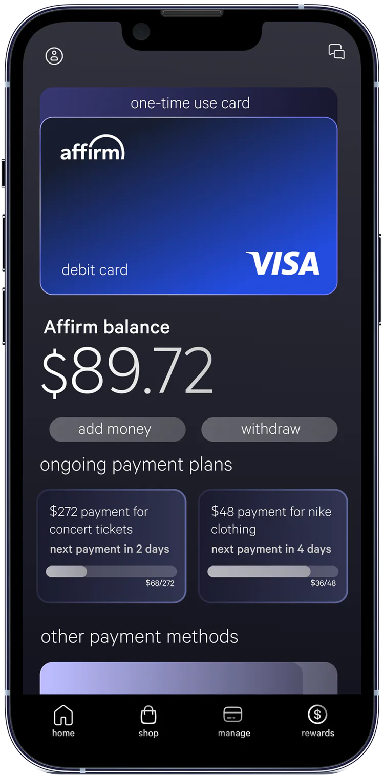
A dedicated home for the Affirm Card
Created a dedicated card experience to make its benefits, usage, and account controls easier to discover and understand.
- Prominent card entry point
- Centralized benefits and activity
- Clearer path to adoption and continued use
Prioritize the product with greater retention potential
One-time-use cards offered a simple option for occasional purchases, but the reusable Affirm Card could support a longer customer relationship. I recommended making the Affirm Card the primary option while retaining one-time use as a secondary option for casual users.
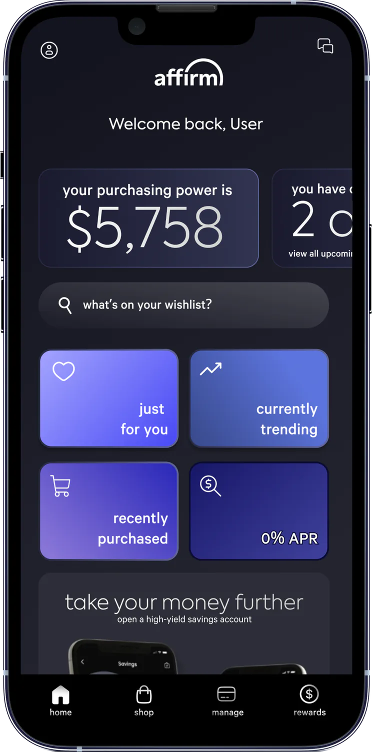
A more engaging discovery experience
Expanded the homepage beyond merchant names by introducing product-focused discovery sections, giving users more engaging ways to explore what they could purchase with Affirm.
- Product-led discovery sections
- More visual browsing experiences
- Clearer paths from inspiration to purchase
Outcome
Affirm’s live app now leads with the reusable Affirm Card, the direction our team recommended to them.
Direct influence cannot be claimed.
- Experience design
5+ product flows prototyped
Translated the strategy into tangible Figma concepts demonstrating how the experience could work.
How I’d measure success
| Intervention | Primary KPI | Guardrail |
|---|---|---|
| Responsible loyalty | Loyalty adoption among eligible users | Late-payment and delinquency indicators |
| Affirm Card | Card activation and continued use | Payment-plan comprehension and support contacts |
| Product discovery | Discovery-to-purchase conversion | Repayment visibility and unsustainable-purchasing indicators |
What I learned
Growth should align with the product mission
I learned that growth decisions require more than optimizing engagement, using Affirm’s mission to shape a loyalty strategy that rewarded financially responsible behavior.
Utility alone does not drive engagement
Affirm solved a clear need at checkout, but creating reasons to return required delivering value between purchases.
Retention depends on extending the relationship
The reusable Affirm Card created an opportunity to shift Affirm from a transactional tool toward an ongoing financial product.